Gender Wage Gap in Australia

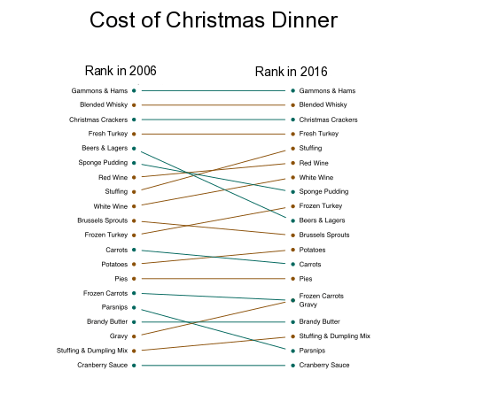
The plot is generated as a part of Makeover Monday. The data comprises of close to 1000 observations. The original story was published here. The plot is inspired from New York Times post on Gender Wage gap in USA. The data for the post is available on MakeoverMonday. The plot was generated using R and inkscape was... Continue Reading →

Slope Chart in R

    The slope chart above shows the rising cost of Christmas Dinner in U.K. The plot is generated in R using the plotrix library. Once the basic plot was generated a few minor adjustments were made using the inkscape. Due to some technical issues i was unable to load the code and Rmarkdown files... Continue Reading →

Debt to GDP Ratio – R and SVG

This is a quick tutorial on how we can manipulate a Scalable Vector Graphic (SVG) in R. R does have the ability to save plots, maps and graphics in various formats (including SVG) but this post is more about how you can quickly generate a very effective graphic using R and an external SVG file. The most obvious question is why not use R to do everything. Well R is great and does everything so well it does lack some power when it come to interactivity. Though i will not cover interactivity in this post i will show you how easy it is to generate effect using SVG.

Reverse Geocode using Google API and XML package in R – PART 1

Almost all the times we com across data that is not in the format we require it to be. Sometimes it has some information we need and other times we require additional information that can be retrieved using the data at hand. In the current tutorial we will explore the issue related to the case where data is present but we need some more information.

pyramid plot

In the current post i will describe one of the easier ways to generate a pyramid plot. The first time i came across a pyramid plot was on New York Times website. The NY times visualization used data from the American Cancer society to show new cases of cancer in 2007. The visualization can be viewed here. I have also seen census bureau use pyramid plots to display distribution of population by age. Flowing data website used an animated pyramid plot to show prevalence of obesity in USA here

Website Built with WordPress.com.

Up ↑