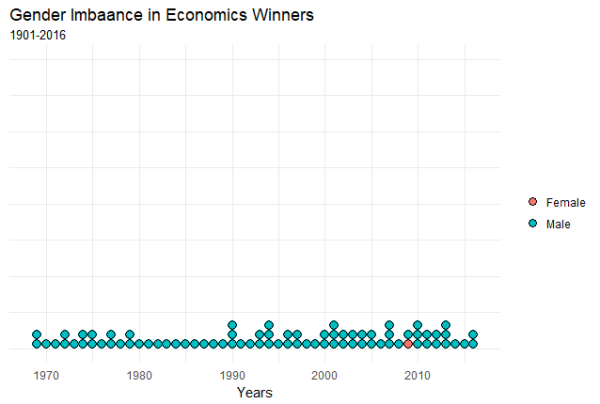
Post shows the gender bias in among Nobel Prize winners in the field of economics using the dot plot in R.
Primarily visualizing data from census bureau of India and other cool stuff using R
Post shows the gender bias in among Nobel Prize winners in the field of economics using the dot plot in R.

part II of Learn how to make a tile map of India.

I visit various websites to collect data. Most of the sites i visit are mostly managed by various Government of India central or state departments / ministries. Given everything is digitized one realizes the extent to which this digitization has brought to light some of the issues related to quality of the websites as well... Continue Reading →

The change in infant mortality rate in India, from 2014 to 2016.
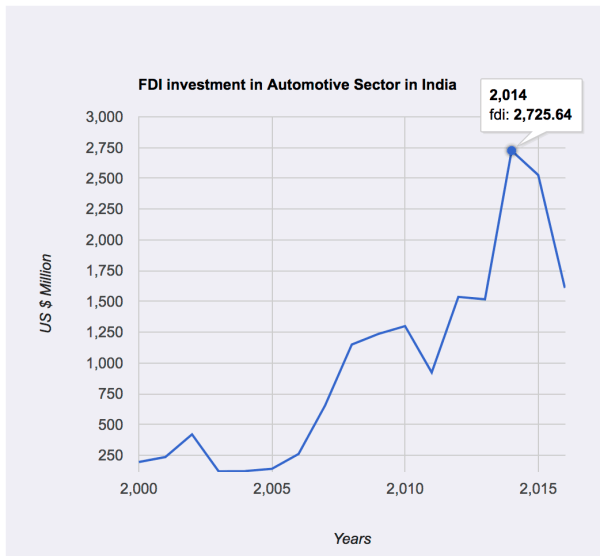
The post introduces generating line chart in R. Using the googleVis package allows us to generate interactive plot in R. The data used for generating the plot is based on FDI inflows in the auto industry.

Tree map to visualize the employment growth in G7 countries over 6 years.
