visualizing statewise murder cases in India from 2010 to 2016 using Geo Facet plot in R.
Murders in India – 2016

Primarily visualizing data from census bureau of India and other cool stuff using R
visualizing statewise murder cases in India from 2010 to 2016 using Geo Facet plot in R.
The National Crime Records Bureau (NCRB) in its yearly publication titled Accidental Deaths and Suicides in India reports 11 main causes of death in India from road accidents. The total deaths in India from road accidents is 148707. The top 4 causes of road accidents are dangerous/careless/ overtaking, speeding, other causes and weather. These 4... Continue Reading →

The change in infant mortality rate in India, from 2014 to 2016.

This article shows how business cycles time periods in India can be shaded to enhance the interpretability of economic indicators. This article also serves as an introduction to creating rectangles in R to identify recessionary time frames.
This article tries to explore the possibility of adopting open source technology like R by Government of India. This article is a beginners step to understanding the endless possibilities of combining the open data initiative with open source technology.
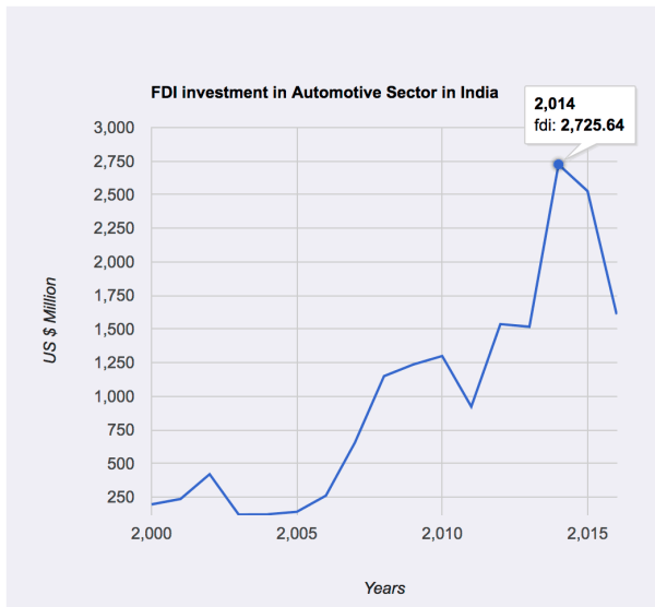
The post introduces generating line chart in R. Using the googleVis package allows us to generate interactive plot in R. The data used for generating the plot is based on FDI inflows in the auto industry.

Tree map to visualize the employment growth in G7 countries over 6 years.

Farmer Suicides have been over a decade in India. The issue of farmer suicides is not widespread and is concentrated in four states

The plot is generated as a part of Makeover Monday. The data comprises of close to 1000 observations. The original story was published here. The plot is inspired from New York Times post on Gender Wage gap in USA. The data for the post is available on MakeoverMonday. The plot was generated using R and inkscape was... Continue Reading →
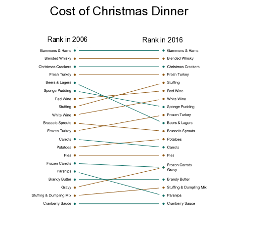
The slope chart above shows the rising cost of Christmas Dinner in U.K. The plot is generated in R using the plotrix library. Once the basic plot was generated a few minor adjustments were made using the inkscape. Due to some technical issues i was unable to load the code and Rmarkdown files... Continue Reading →
