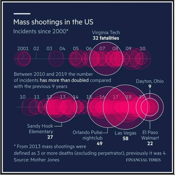
How many deaths occured in USA from Gun Violence since 2001.
Primarily visualizing data from census bureau of India and other cool stuff using R
How many deaths occured in USA from Gun Violence since 2001.

Article provides a concise discussion of the most recent India Economic Survey.

This posts discusses the limitations of the chart from Ministry of Power website and how it could be improved.
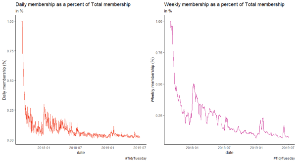
Using R4DS membership data to create line plots in R.

The animated visualization shows the rise in population for Indian states from 2001 to 2026. Learn to create a bar race chart using flourish.
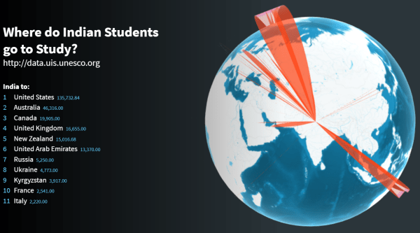
Interactive visual showing countries most preferred by Indian Students in 2016 . Learn to create this using a web based tool called Flourish
Articles shows how important it is for the Government of India to publish reliable and accurate data.
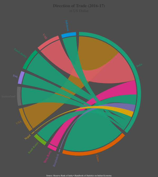
Learn to create interactive chord diagrams in flourish using trade data from India
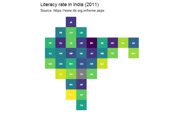
This post discusses two interesting post on tile grid maps and how they can be used to visualize data from India.
The population of India is projected to reach 1.39 billion by 2026. The important issue facing India is how to sustain this?
