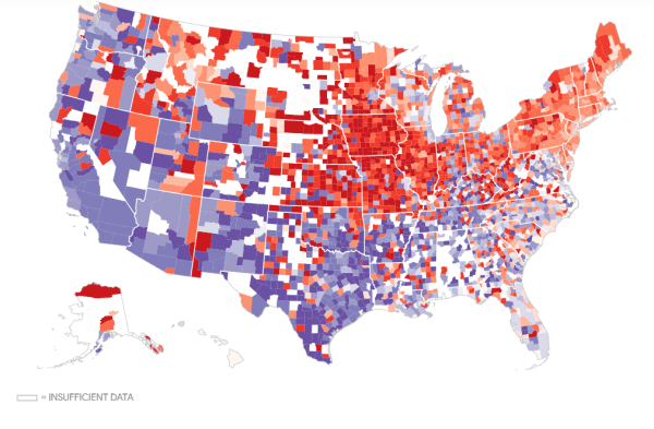
Visualization showing the pizza capital of the USA.
Primarily visualizing data from census bureau of India and other cool stuff using R
Visualization showing the pizza capital of the USA.

The animated visualization shows the rise in population for Indian states from 2001 to 2026. Learn to create a bar race chart using flourish.
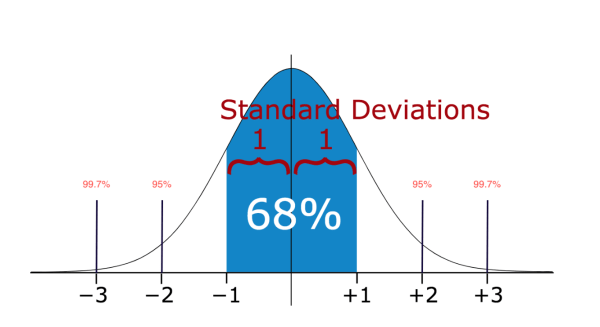
Articles explains methods to detect outliers and strategies for working with new data.

Interactive visual showing countries most preferred by Indian Students in 2016 . Learn to create this using a web based tool called Flourish
A great video that explains wealth in USA and wealth tax using great visual story telling technique.
Learn to visualize Hierarchy or grouped data in flourish using the data related to languages in India
Articles shows how important it is for the Government of India to publish reliable and accurate data.
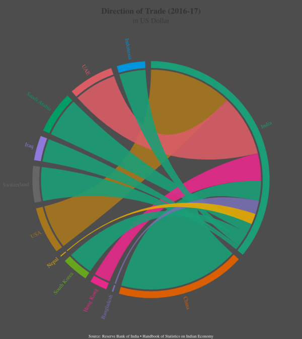
Learn to create interactive chord diagrams in flourish using trade data from India
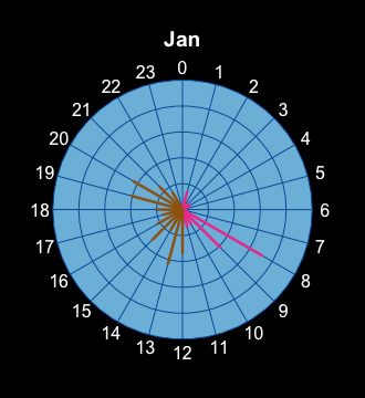
Learn to create a Radial plot in R using the Iphone health data from your Iphone.
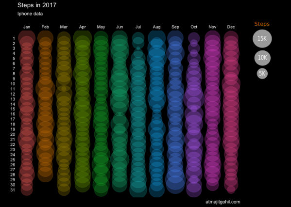
The circular plot is generated using gggplot2 and Iphone health data showing the number of steps walked during 2017.
